Animation
Monday, 18 June 2018
News
The text in front of the footage shows the topic, the time of this broadcast, as well as the less important events that have happened at that time. The logo of the broadcaster is also shown right next to the left of the clock.
The text most likely is on a separate screen and is connected to the camera, it was probably made beforehand as to not complicate things.
The colour of the text is red and white, the reason is because red is very easily noticeable and usually signals that something important has happened. White is used to make it easier to read and it also fits with the text font.
They most likely used a green screen or have a window behind the reporters.
This has elements of compositing and motion graphics.
Monday, 21 May 2018
Music Video Inspiration
There is a lot of inspiration that I got for the music video.
The most important thing in this is the fact its meant to raise awareness of knife crime and gun violence that has spiked in London.
The inspiration for the idea came from me watching a morning BBC outlet and them talking about how several more people got killed last night and how the situation is getting worse, they even showed what places to avoid as to not die.
That made me go with a hybrid music video.
Effects of video:
The idea of the style came to me after doing some intense research on the topic of how rock music videos are shot and what style they followed.
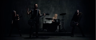 Skillets invincible music video gave me the most when it comes to ideas, the dark backdrop and clothing gave me the most stereotypical rock set up.
Which is what I wanted because rock is all about being loud and voicing your opinion.
I then wanted to put some special effects into the music video to make it creative and kind of sureal.
The Rule the world music video by Zayde Wolf had a lot of glitch effects which I liked very much and I wanted to try and make the glitch effect in my music video to make it more surreal and also because I wanted to try something new.
I was then looking through some videos with subtitles that display the lyrics in a unique text style which I wanted to incorporate in several scenes in my music video.
This is a song about a game but the way they used the text was what I loved about it,

whenever it switched from a subtle rock lyric and into a hard metal one the text changed from a more standard to a more aggressive one and it even changed colour as well. I will try to do that in several scenes as to draw attention to specific words of the song.
The lyrics of the song also made want to make a more of a lyrical music video but I also wanted to include a narrative to it so I made a bit of a story out of the violence in London as to represent the regular people and the people who are dragged into this world of violence.
Instead of just making the text appear in front of the viewer, use a animation to make it more creative and entertaining.
They either slide it in or make it disintegrate just to reconstruct into another lyric. All of which makes the video very entertaining to watch.
Production:
I for the first part shot the actor lip syncing the lyrics of the video and then I started to shoot the scenes that would be used for the first half of the music video, I then proceeded to make several animations and then took a shot of the backdrop as too fill in the blanks and to put the lyrics in the spaces that I haven't shot scene for.
I didn't apply any of the special effects since I will put them after the music video has all the footage, kinetic typography was somewhat used in the rough cut and it did give people a idea of what I am going to do.
The lighting in the music video was made to create a greyish white back ground after applying the bleaching effect which makes the scene more dark overall.
To apply the glitch effect to the text I used the Premiere Pro program.
I then used the text tool on a specific frame and typed what I wanted it to say.
I then applied a Wave Warp but changed certain attributes so that it would give me the desired effect, I changed the Wave type to a square so that is looks like a glitch, the changed the height and width to make sure the glitch was prominent and was big enough to see.
I also changed the direction to 0 so that it goes up and not to the sides, the speed was also set to 1 so that it looks quick and also because my program couldn't render any speeds higher than 2 and 1.
To add the glitch effect to the footage was a bit more tricky.
I first added the footage I wanted to add the glitch effect, I made four copies of the footage and added a channel mixer to each off the footage.
I changed several channels on each of the copies.
RED-RED was set to 100 on the first copy and GREEN-GREEN and extra was set to 100 on the next copy, and etc.
This will make each copy have a specific colour to it which is what we want to make the glitch look realistic/authentic.
I then move each layer just a bit to add a little bit of detail to the whole thing.
This is what it should look like.
You then do the actions in that you did with the text and then your half way done.

After that you apply a mosaic to the each piece of footage to make it more blocky
This what you should get after adjusting the mosaic to your licking.
After this is done you put a adjustment layer under all of the clips and then you merge it together and after that you grab the original footage and place the glitchy version above the original and cut the bits of the original where you want the glitches to appear.
Monday, 26 March 2018
Composite video example
For this task I am required to explore different applications of motion graphics and compositing to devise and produce a sequence(s) to be
included in my music video that I am currently producing.
No.1 Compositing Music Video Final by Angelina Monetz
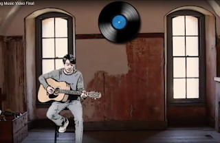
They then applied the background and the different animations for example the large CD at 0:42.
They also included a picture of a old room which they put behind both the CD and the singer/guitarist.
They also used motion graphics in the video with form of kinetic typography in the video which made the text look like sound waves which was very clever and interesting.
The video also used a very interesting way of editing the singer with the footage. They made use of repetition and thanks to the green screens isolation effect it made it look very seamless.
Its also filled with 2D animation and graphics.
No.2 Fireflies by Amber Gan
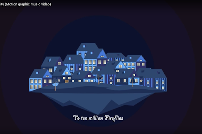
This whole video is a motion graphic which was done in a vector graphics style program.
They used a very cartoonish style of animation which made it very friendly towards the audience.
It also makes the whole video feel like your in a different world.
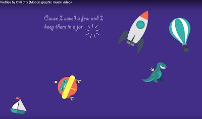
They added different things like toys and space ships which when combined with the animation style and setting it makes it feel like your sleeping and this is your dream or someone else's.
This is a 2D animation so it could have been made in a photoshop style program.
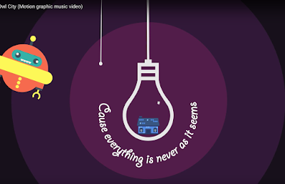
Its also very abstract for example it transitions from you looking at a regular house to then it being contained in a lightbulb and then a robot shutting down the bulb. This makes it feel like your or someone else's dream has just ended and they have woken up.
The text is also utilises kinetic typography as it appears and disappears as well as explodes as a way to appear and vanish.
Not to mention the font of the text makes it feel like its from a kids book or some kind of lullaby.
No.3 Its a Beautiful World by Samjt Hew
This music video is completely made out of motion graphics which could have been done in a vector graphics style program.
The video uses a cartoonish style of animation which makes it very friendly to the audience at first.
However the video uses this animation as a way to send a deeper message which is "protect the environment".
The video follows the lyrics of the song quite closely and uses them to support its point.
The video covers multiple nationalities in the video such as British, Italian, etc.
Which means that the issue that this video is trying to promote isn't a single persons problem or of a single country but of the whole world.
It also shows that if humans tried to help then we could make a difference.
The video also has a strong influence of 2D animation.
It makes heavy use of imagery and graphics.
It also has a strong emphasis on making animals seem like they are also to some extent like humans and have feelings.
For example an elephant was crying because his forest was cut down and he lost his tusks because of illegal poaching.
Another example is this penguin on the side is sweating because the sun is very hot and is melting the snow the penguin needs to survive.
No.4 The Show Lenka by Amber Gan
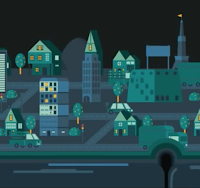
This music video is completely made out of motion graphics and would have been made in a vector graphics style program.
The video has a very prominent 2D graphics and animation influence.
The animation is very friendly towards the viewer.
It also focuses on the story of a girl who is looking for love but can't seem to grasp its meaning.
The video also uses a wide variety of kinetic typography by displaying the lyrics of the song.
The video also emphasises that love is slow and needs time which is reinforced by the image on the right which compares it to traffic which is shown as, slow and time consuming.
The video is also very abstract and moves the viewers perspective over multiple places or dimensions.
This could mean that this is just in someones head.
The video also shows how small a single persons desire is compared to the world and a good example of this would be the image on the right, which shows a bird (the person) and a planet (the world) being compared by size to one other.
Monday, 12 March 2018
Motion graphics
This image is a pattern with a hint of repetition.
This is a balance combined with unity.
This image is a pattern with a hint of repetition as well as the inclusion of rhythm.
The background of the room is detailed with maps, the name of the reporter. The text details the current topic with the logo of the news outlet being on the side whilst simultaneously showing the current stock exchange rate.
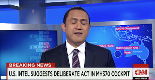
The background was probably done by using a green screen that has been placed behind the reporter or have a actual set up of TV screens placed behind him.
The text in front of him is probably on a separate screen that is then connected to the main camera,
the text was most likely created before hand.
This image has elements of compositing and motion graphics.
This is a balance combined with unity.
This image is a pattern with a hint of repetition as well as the inclusion of rhythm.
The background of the room is detailed with maps, the name of the reporter. The text details the current topic with the logo of the news outlet being on the side whilst simultaneously showing the current stock exchange rate.

The background was probably done by using a green screen that has been placed behind the reporter or have a actual set up of TV screens placed behind him.
The text in front of him is probably on a separate screen that is then connected to the main camera,
the text was most likely created before hand.
This image has elements of compositing and motion graphics.
Monday, 26 February 2018
Animated Advert
The animated advert was a difficult and interesting project to do and I will describe how I did it and what problems I encountered.
At the very beginning I made several ideas for the characters first, the first idea was thrown into the bin since they were too cartoonish.
The second and third ideas were combined together to make the character who I like to call Mr. iS:
The idea had arms and legs but I then settled with just the little fin at the top since I wanted to make it look more serious.
The shape was easy to make and redraw in photoshop so animating it didn't take long which was a really good factor since the dead line was only a week away.
The idea for the shape of the character (which was a square) came to me since the logo of the company was a square so I thought why not turn it into a character and at first I wanted to make it as a 3D character.
The idea was taking shape and I was happy with how it looked but, I didn't know how to animate it and I started running into problems with the dead line so I chose to make a photoshop animated version which was much better in the aspect of animating and wasn't as complex.
We then moved to the spect of filming the footage and then merging it together with the animation.
I easily came up with a way of merging the animation and the video footage.
I first filmed the footage and then made the animation so that it has space for the video as well as the text.
Each scene of the animation was also reversed since I was going to re-use them, it would also save me time making another scene all together.
This proved to be highly effective and is a bit of a shortcut in a way.
I then extend the animation in the final cut program so that I wouldn't have to extend it in photoshop, that saved me a lot of time but there were a few problems with the video which I didn't take into account.
During the instillation of the voiceover I discovered that some of the scenes were a bit too short and the voiceover was longer than initially anticipated, I quickly adjusted this by extending some of the scenes and shortening some of the voiceover lines.
In the end the product was well received and I was happy with how it turned out.
Monday, 5 February 2018
Spaceship GIF
This is my attempt at creating a GIF.
The whole thing was made from scratch using photoshop and it consists of 20 layers each 0.1 seconds long.
The beginning was very simple nice I just needed to create the basic assets as a foundation for the more detailed sections of he GIF, I first made the ship which I grabbed inspiration from Star Wars Rogue Ones gunship in terms of wings the rest was made from scratch.
The first thing I did was make a outline of the ships body, then I started adding things like the cockpit, vents, and reactor as well as engines on paper. After that I moved on to powerpoint and started making the outline of the ships body there in a separate layer.
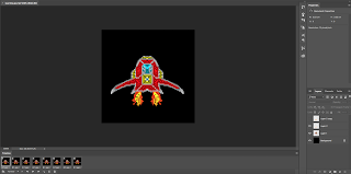
I then moved on to more complex things like detailing the hull.
I also added two small lights on the tips of the wings to make it seem like a actual spaceship.
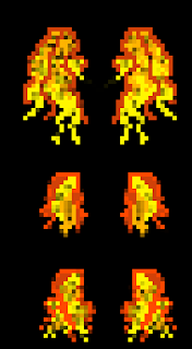
I then started making three different versions for the flames.
I wanted the flames to look unique and to be able to go from small, medium to large which I succeeded in producing.
The flames were all all made from the first one (the small flame in the middle) after which I moved on to the make the medium sized flame and then the large.
I first made outline of the onager sections then added the yellow and dark orange sections, after I was happy with how it looked I used the eraser tool to add a bit of a shade to the flames to make it look more alive in a sense.
After that I went through the challenge of creating the effect of it moving, I first moved the ship up and down in the layers to give the effect thats its somewhat hovering in space, then I started creating different STARS for the background so to make it seem as its moving.
During this process I had a lot of problems such as the stars looking too bit, not moving at all and over all the colour as well.
I created five versions of stars alone all of which were meant to work together in one gif, but it was a ugly mess of pixels that were mashed together which wasn't what I wanted at all.
In the end I started from scratch with the stars and made two completely new layers which I then used one after another in the animation.
The stars looked more like sticks which has a fading out effect at their ends which makes them look like they were passing by.
Strangely they were compared to gunfire rather than passing stars.
I then created a small purple comet of sorts to give that extra feel of being in space where asteroids and comets are common, it also had several versions of it, initially it meant to look more egg shaped with a more smooth cloud of smoke behind it.

But that was way too big and was very difficult to animate, so I went with a more skinny version that had a more dusty appearance with particles rather than with smoke, my inspiration was the red stone torch from Minecraft which I actually modified a bit to make it more round rather than square.
I also made several different versions of the particles so that whilst passing by the ship the comet looked like it was actually leaving behind particles.
The difficult part was when I had to link all of these factors into a gif, I had to start with a certain flame and make sure it end on the flame that was at the start of the animation and same goes for the stars and the position of the ship.
It took me a long time to make the animation seem seamless because I was always stuck at the fact that the ship was in the wrong position or that the flame or lights were not correct.
In the end I created the gif in a format of 2040 pixels and uploaded it to youtube and made it its separate form as a GIF.
Monday, 15 January 2018
Subscribe to:
Comments (Atom)


